WHITE SPACE
So far in my posts I focused on single graphs and panels, but now I would like to tackle the general organization of an entire figure. Figures tend to be very crowded, a consequence of big amount of data and restrictions in number of figures. As a rule it is good to avoid busy figures, but it's rarely possible. Therefore, it's good to know some basic rules that improve readability and help keeping the flow of the story.
The key to effective storytelling through figures is the use of white space. It may sound silly, as we are mostly told to focus on the data itself, but white space is just as important.
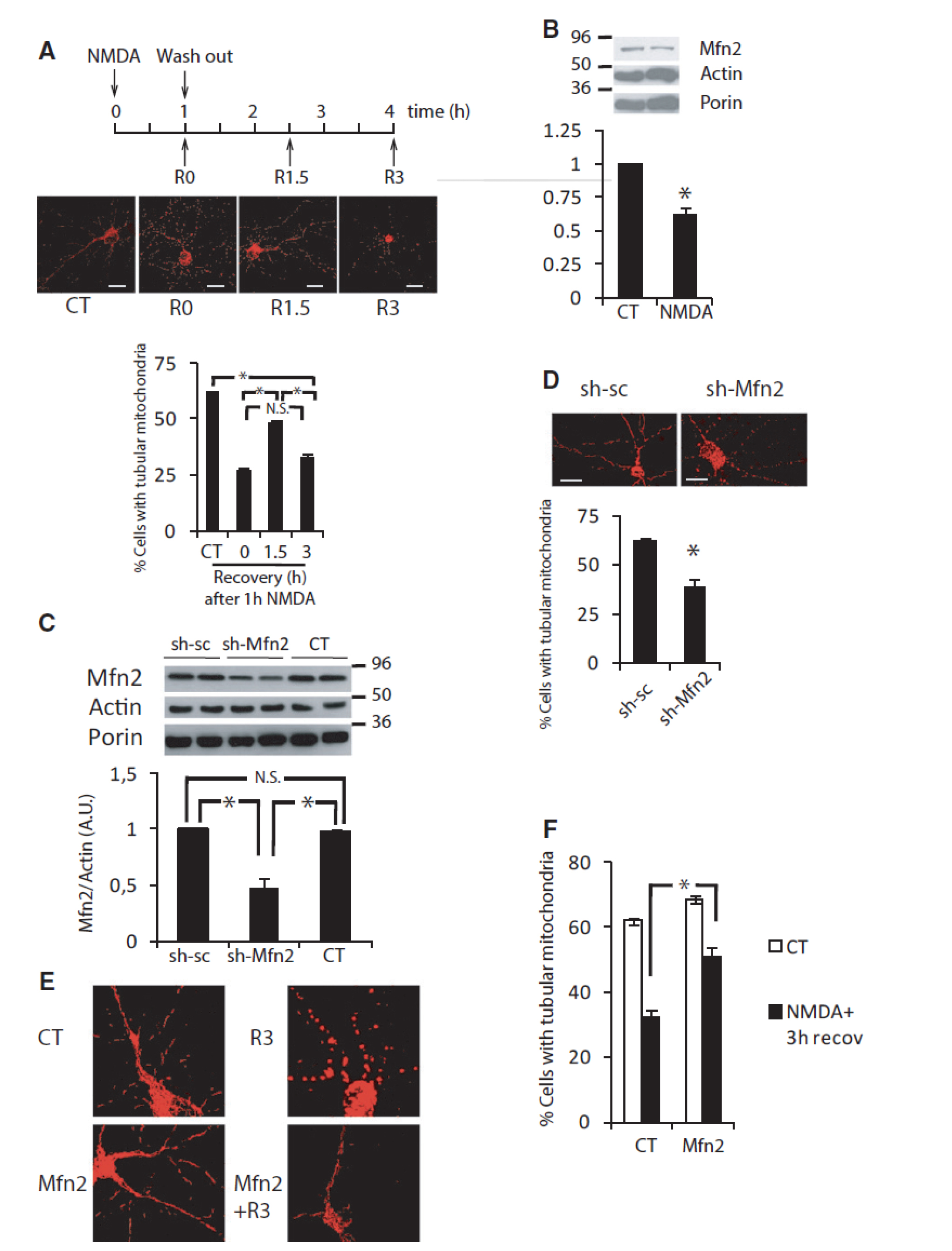
Let's start with an example (Martorell-Riera et al. 2014)
the way this figure is organized makes you read it as follows:
After a moment you will realize that is not the order authors intended, nor the one that makes sense. Another striking thing is general messiness (achieved by different scales and sizes of graphs/images) and a lot of white (non-used) space, which makes it look like panels were randomly put together.
Let's take it one panel at a time and then assemble them into a figure.
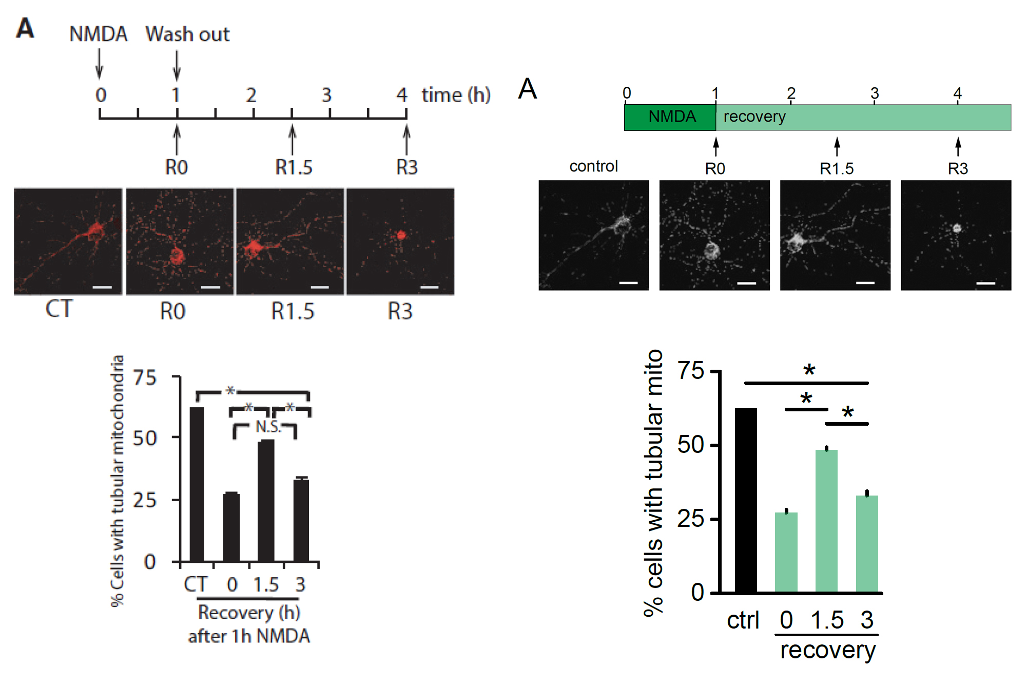
Panel A
I introduced color to thescheme to differentiate between different conditions. Additionally I took away the color from the images, so that even in this small version details became more visible.
At the same time this allowed me to remove most of the text. Finally, I cleaned the "significance bars" by removing all the extra ink.
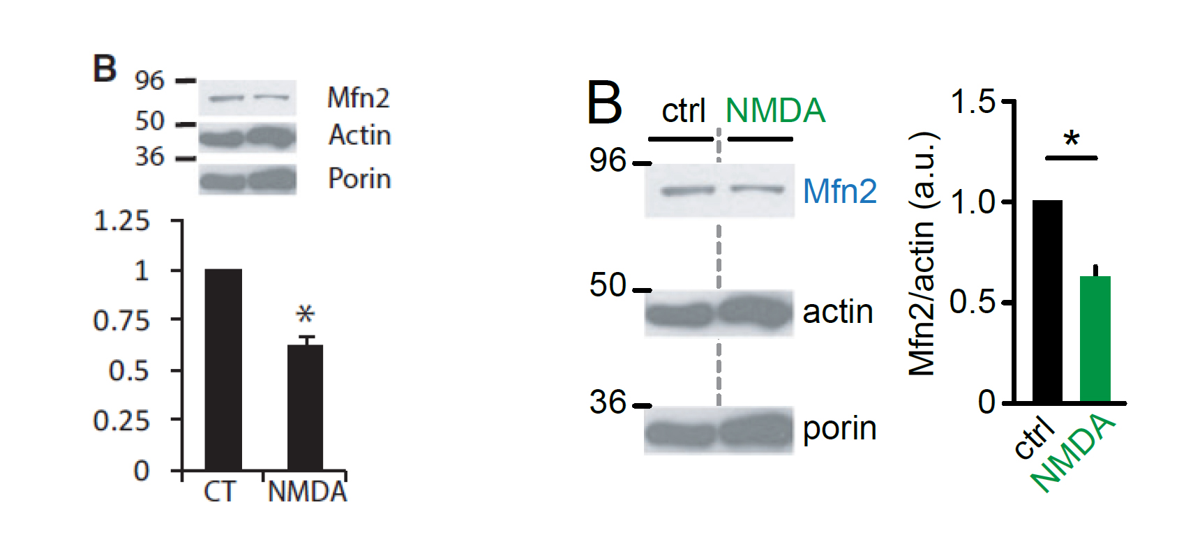
Panel B
Small changes:
-rearrangement of the blots vs graphs
-increase the size of blots, so they are easier to read.
You can now appreciate the addition of the color in the graph which corresponds to the condition from panel A's scheme.
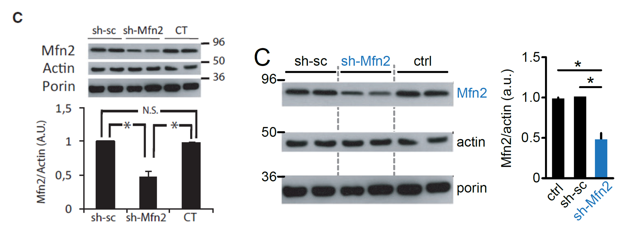
Panel C
Similar changes as in the panel B. Also blue is now assigned to represent results of mitofusin2 knock down.
Added white space between the blots make the panel "breath", so it feels less crowded in small space.
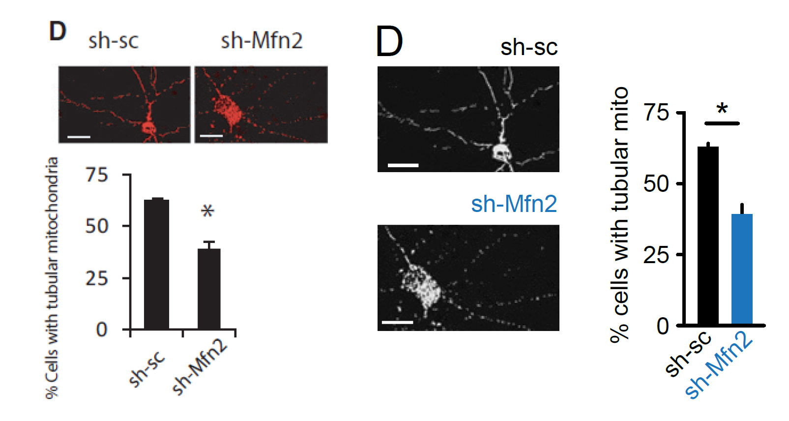
Panel D
Again: changes in images' look up table (LUT) and color added to the graph. Small changes in arrangement make better use of the available space and allow for bigger images.
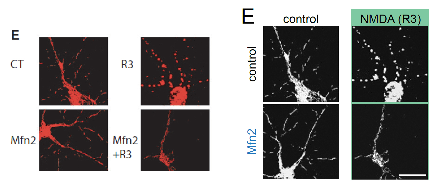
Panel E
Adjusted LUT, added green bar to indicate which images represent neurons treated with NMDA (following color scheme from panel A).
A small detail that often escapes writers attention is "orientation" of the samples. In panel E all neurons are shown with their cell bodies at the bottom, but the Mfn2. This makes Mfn2 stand out from the rest, driving attention of the reader away from the actual phenotype. Small change - big impact.
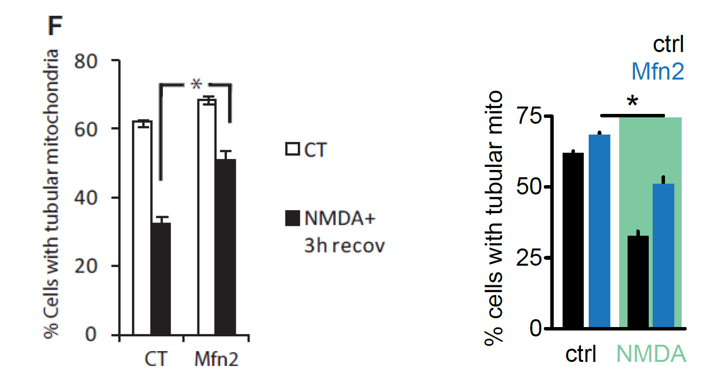
Panel F
I followed the same design rules and with small changes help the reader navigate through the graphs and relate them to certain conditions introduced at the beginning.
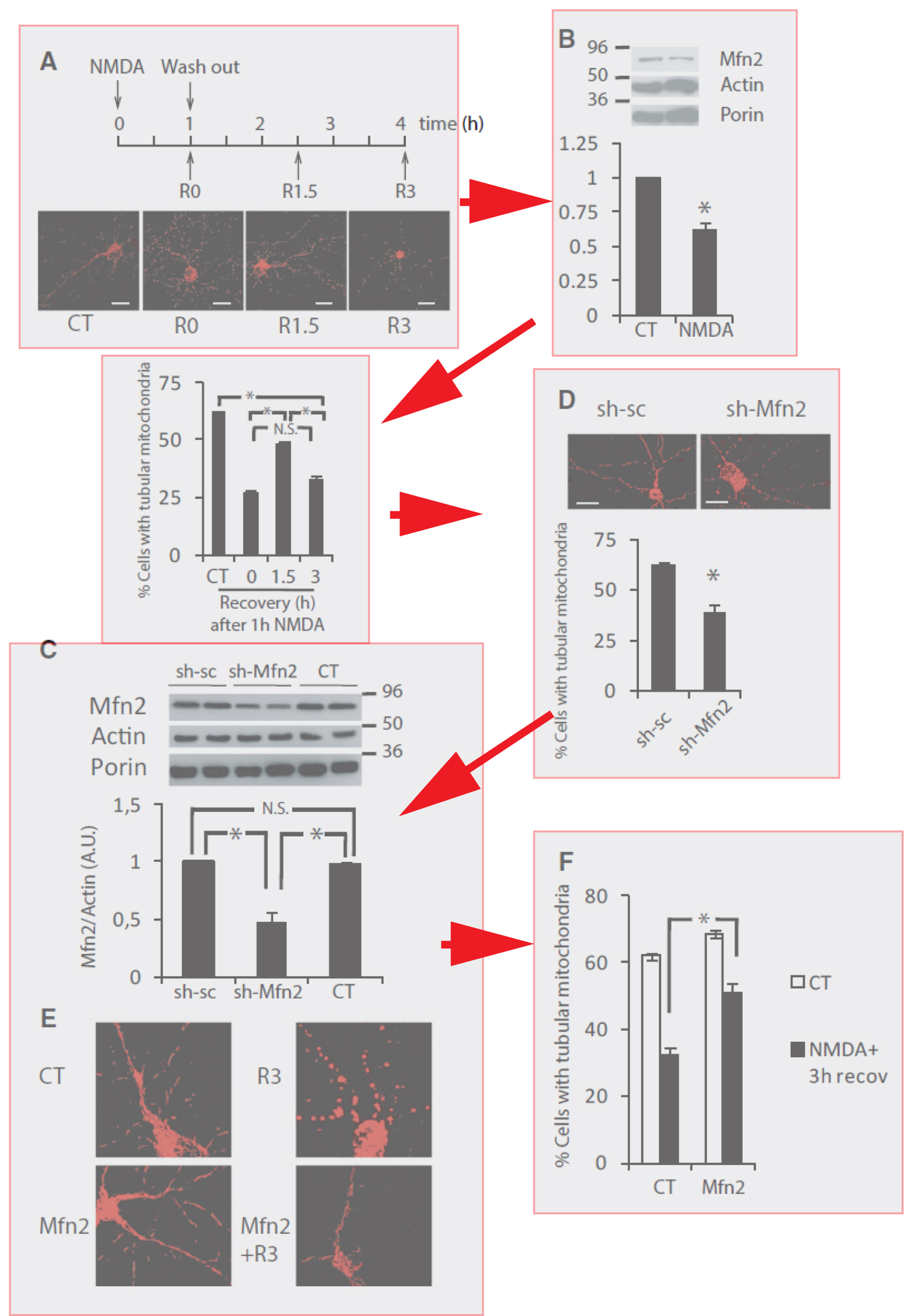
So now that we have all the elements, let's put them all together:
It becomes more obvious now that use of color helps the reader navigate through the figure and relate results to the treatment. Also the overall flow of the figure is more consistent, as all of the original data is followed by a quantification. Finally using white space more efficiently reduced the size of the figure without compromising its readability.
